A key factor in the value of your site is a smooth and problem-free user experience. You don’t need to be a UX specialist to ensure good UX. Here are three quick tests with easy-to-use tools that will help you pinpoint any glaring UX issues.

1. Check for slow load time
Slow load time is bad for many reasons. Here are three you should care about:
- Frustrating and inefficient for users.
People on the web are notoriously impatient; if a site is slow to load on the first visit, a significant segment of users will abandon the site. Even those who don’t immediately bounce will make note of the slow performance and may choose your competitor instead. - Sign of a poorly-built site, decreasing your credibility.
Slow loading factors into people’s impression of your brand. Even if you weren’t responsible for building your site, it’s still a touchpoint with customers and thus a reflection of your brand’s commitment to quality. - Negatively impacts SEO efforts.
Search engines factor load time into your site’s ranking, meaning that if you and your competitors have similar relevance for a search term, but their site loads faster, Google will prioritize them over you in search results.
There are multiple moments during the load experience that can affect whether a user perceives it as “fast” or “slow.” Google’s PageSpeed Insights tool will give you a Speed Score, which is a rollup of metrics like the following:
- First Contentful Paint (FCP): FCP measures the time from navigation to when the browser renders the first bit of content. This is an important milestone for users because it provides feedback that the page is actually loading.
- Speed Index: This page load performance metric shows you how quickly the contents of a page are visibly populated. The lower the score, the better.
- Time to Interactive (TTI): TTI measures how long it takes a page to become “interactive,” or when it has displayed useful content (FCP), event handlers are registered for most visible page elements, and the page responds to user interactions within 50 milliseconds.
The recommendations from PageSpeed Insights are a great starting point for a discussion with your dev team about making speed improvements. Make sure to test a few different templates to see how the structure and amount of content and media impacts speed.
2. Check for broken links
Just as with slow load time, broken links on your site are frustrating for users, reflect poorly on your brand, and hurt your SEO. When users or search engines browse through your site and click on broken links, they will be directed to content and pages that don’t exist. That means your users are not getting the information they’re looking for, and may go looking for it from your competitors. That broken link just lost you some credibility and potential business – and your site will probably rank lower in search engine results.
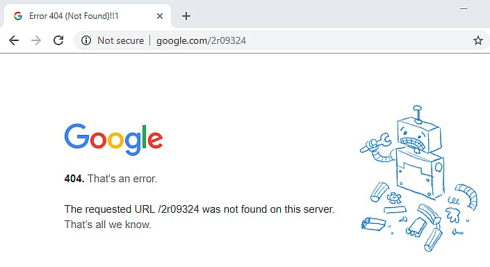
Look familiar? 404 errors are one possible outcome of broken links.
Check your site for broken links with Dr. Link Check, a one-click bot that crawls your site and gives you a report of the links that need your attention. The resulting report emailed to you contains, among other high-level details:
- Broken links: properly-formatted URL, reasonable server response time, valid SSL certificate, no errors indicated (such as 404 for a missing page)
- Blacklists: the link does not appear on any blacklists for hosting malicious content
- Parked domain: the linked site has valuable content (for example, it contains more than just ads)
- Link direction: internal vs. external
- Exact locations: where links are found in the front end code.
It’s always best practice to regularly schedule an audit to remove, update, or redirect broken links.
3. Check for low contrast
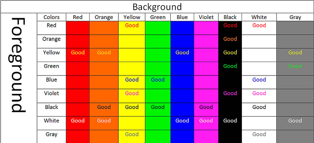
A higher-contrast design is easier to read and more attractive to the eye. Imagine trying to read a site with a yellow background. What would be easier to read: white text, or black text? The higher-contrast black text would be less straining on the eyes and much more visually appealing.
Visual design makes an impression on people before they even start consuming your content. The color chart shows how the basic colors look contrasted against each other – but remember that acceptable contrast can change with even small changes in color hue, saturation, and brightness.
Low contrast is also an accessibility issue. When people hear “accessibility,” they often fall into the trap of thinking they need to compromise on visual design to accommodate visitors who have disabilities. This couldn’t be further from the truth! Your website can be one of your most powerful brand assets, and following accessibility guidelines can only make it better. Read more on why accessibility matters
Although we recommend having an ADA expert review your site to make sure it complies with all the rules, color contrast is a good place to start. It is a key piece of the accessibility puzzle, and while it’s a very common problem, it’s also one of the easier aspects of ADA compliancy to identify and fix. You can check for contrast issues and other accessibility red flags using WAVE.
WAVE is a web accessibility evaluation tool with a free page checker and free browser extensions. Simply put in a link to generate a summary of detected details along with documentation for how you can make your page more accessible.